Mobile Billboards vs. Digital Ads: Best Choice for Local Businesses?
Which Is Better for Local Businesses? Mobile Billboards vs. Digital Ads Local…
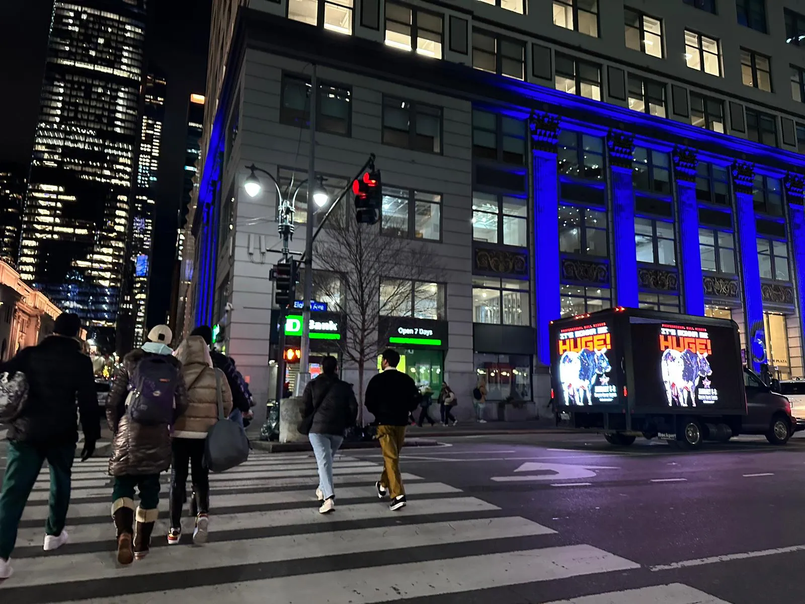
Mobile billboard ads have become a dynamic and effective way to capture attention on the go.
Mobile billboards can reach a broad audience, making them valuable for brands aiming to leave a strong impression.
This blog will explore creative ideas and essential tips for designing eye-catching mobile billboard ads, focusing on effective color schemes, typography, messaging, and the importance of simplicity and clarity.
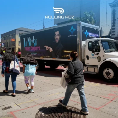
Mobile billboard ads are essentially billboards mounted on trucks or other vehicles, allowing them to travel through various locations and reach diverse audiences. The mobility of these ads offers unique advantages:
Unlike stationary billboards, mobile billboard ads can cover multiple areas and target different demographics in a single day.
Moving ads attract attention more effectively than static ones due to their dynamic nature.
Mobile billboards can be strategically routed to specific locations where the target audience is most likely to be found.
To harness the full potential of mobile billboard ads, it's crucial to focus on their design. Here are some creative ideas and tips to help you create effective and visually appealing mobile billboard ads.
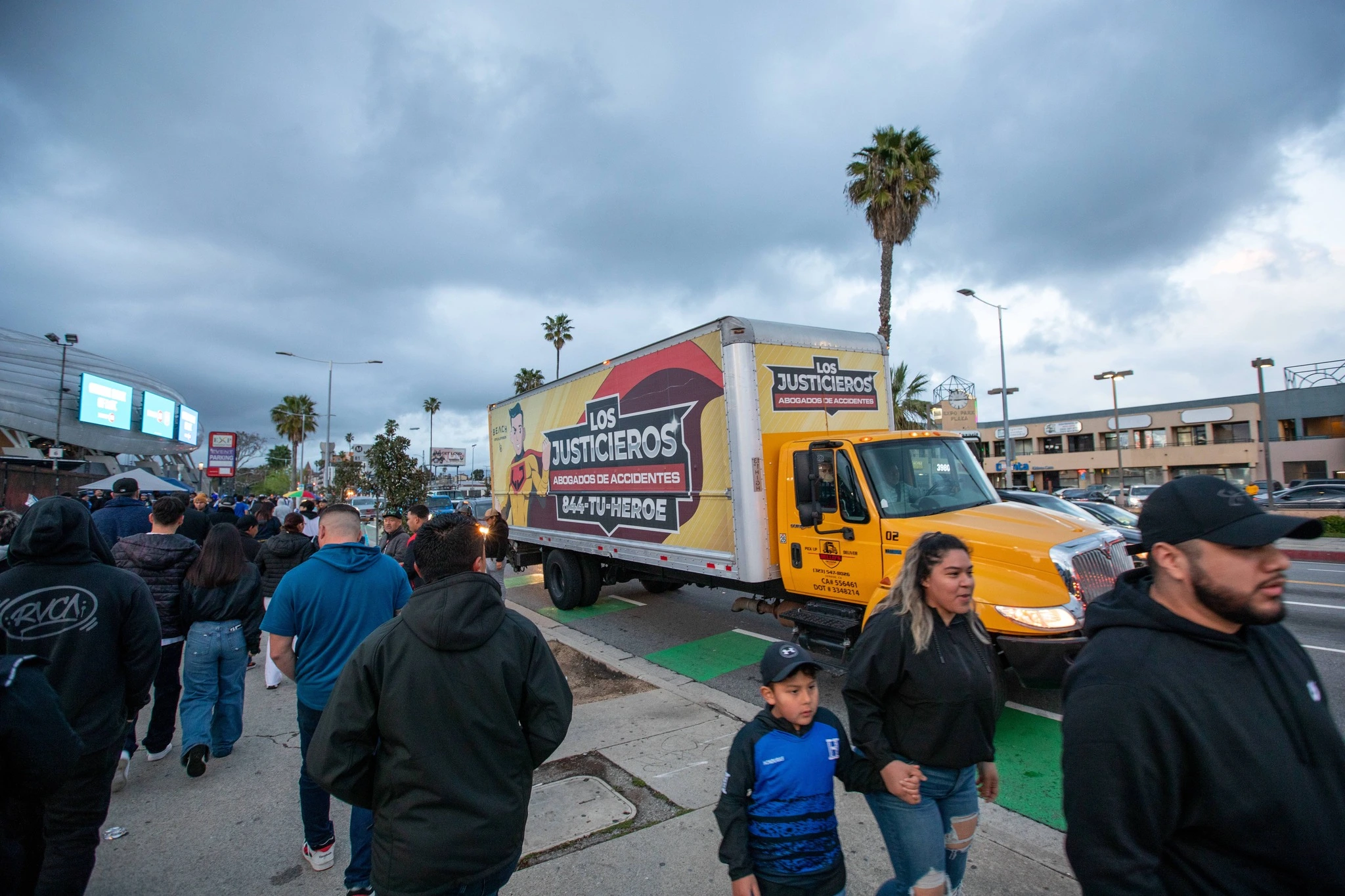
Color is a powerful tool in design, and it plays a critical role in making mobile billboard ads stand out. Here are some tips for choosing the right color scheme:
Use high-contrast color combinations to ensure that your ad is easily readable from a distance. For example, pairing dark text with a light background or vice versa can make your message pop.
Incorporate your brand's colors to reinforce brand identity and ensure consistency across different marketing channels.
Consider the psychological impact of colors. For example, red can evoke excitement and urgency, while blue can convey trust and professionalism.
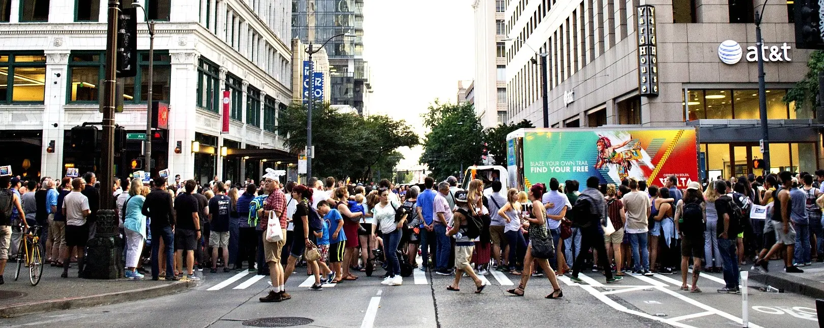
Typography is another crucial element in mobile billboard design. Given the limited time viewers have to absorb your message, your text needs to be clear and readable. Here are some typography tips:
Use large, bold fonts that can be easily read from a distance. Avoid overly decorative fonts that may be difficult to read quickly.
Stick to simple, sans-serif fonts that are clean and straightforward. These fonts tend to be more legible and professional.
Establish a clear hierarchy in your text. The most important information, such as your headline or key message, should be the largest and most prominent.

The messaging on your mobile billboard ad needs to be concise and impactful. Viewers only have a few seconds to grasp your message, so make it count:
Limit your text to a few words or a short phrase. Aim for a headline that is 7 words or fewer.
Include a clear call to action (CTA) that tells viewers what you want them to do next. For example, "Visit Our Website" or "Call Now."
Use memorable taglines that are easy to remember and resonate with your audience.
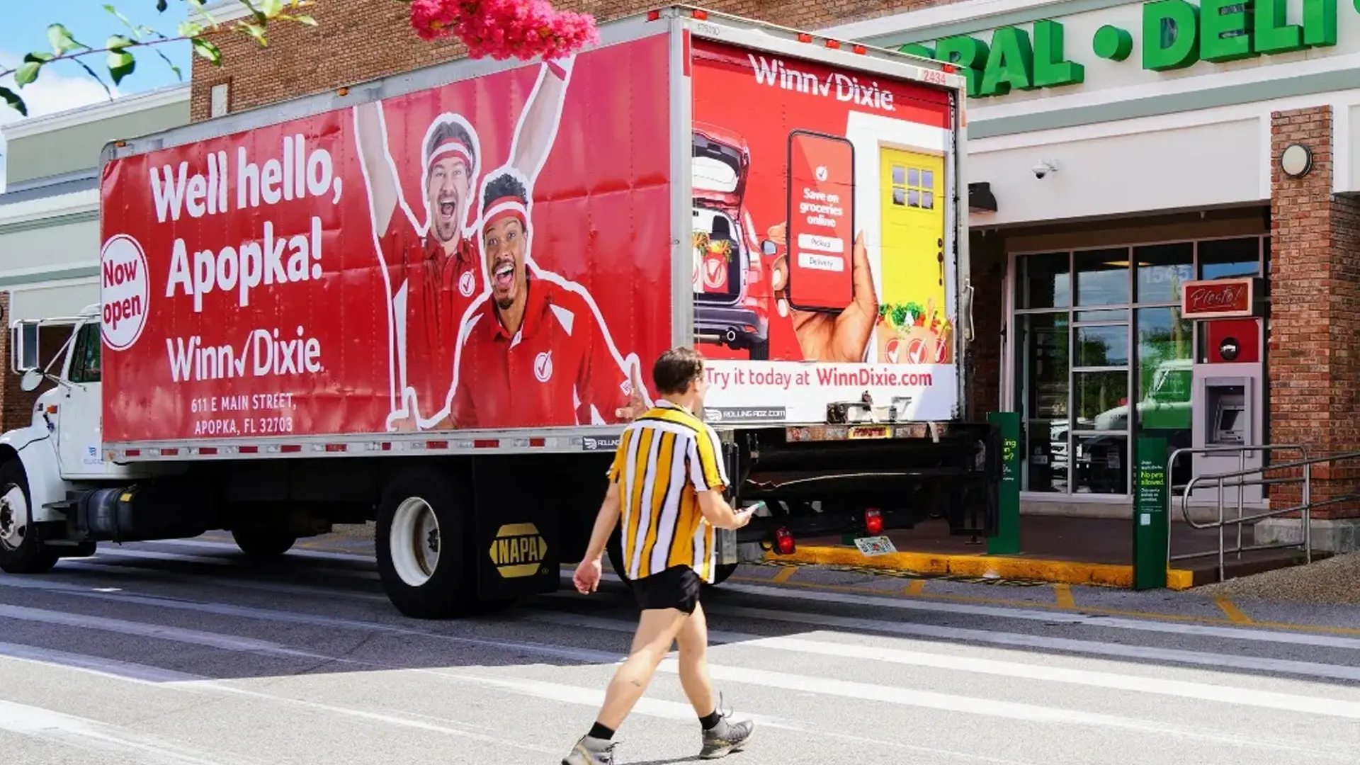
Images can enhance the visual appeal of your mobile billboard ad and help convey your message more effectively. Here are some tips for using imagery:
Ensure that your images are high resolution to maintain clarity and quality, even when viewed from a distance.
Choose images that are relevant to your brand and message. Avoid generic stock photos that may not resonate with your audience.
Use images sparingly to avoid clutter. A single, powerful image can often be more effective than multiple smaller ones.

One of the most important principles in mobile billboard design is simplicity. Given the limited viewing time, a cluttered or complicated design can confuse viewers. Here’s how to keep it simple:
Embrace a minimalist design approach with ample white space to ensure that your message stands out.
Focus on one key message or idea. Trying to convey too much information can dilute your impact.
Make it easy for viewers to quickly understand your message and what action they should take next.

Since mobile billboard ads are on the move, you can play with the concept of movement in your design:
Create layouts that suggest motion, such as angled text or graphics that give the illusion of speed and direction.
Consider a series of ads that tell a story or convey a message in parts as the vehicle moves, encouraging viewers to follow along.
Finally, it's essential to test your mobile billboard ad design and iterate based on feedback and performance:
Create multiple versions of your ad and test them in different locations or times to see which performs best.
Gather feedback from viewers to understand what works and what doesn't. Use this information to refine your design.
Track metrics such as engagement, conversions, and brand awareness to measure the effectiveness of your ad.
Designing eye-catching mobile billboard ads requires a blend of creativity, clarity, and strategic thinking. Remember to continuously test and iterate your designs to maximize their effectiveness and ensure that your message reaches the right audience in the most impactful way possible.
In the fast-paced world of advertising, mobile billboards offer a unique opportunity to stand out. By following these tips and ideas, you can leverage this powerful medium to enhance your brand visibility and drive your marketing goals forward.
Speak to a mobile billboard advertising specialist for all your OOH media solutions.
Which Is Better for Local Businesses? Mobile Billboards vs. Digital Ads Local…
How To Choose the Perfect Route for Your Mobile Billboard Campaign Selecting…
Top 5 Locations in California Where Mobile Billboards Have the Highest Impact…
A Comprehensive Guide How Much Do Mobile Billboards Cost? Mobile billboards are…
Powerful tool for your brand message. What to Look for in a…
Rural Reach How Mobile Billboards Are Connecting Brands with Hard-to-Reach Audiences Reaching…
Get Exclusive Deals & Our 1x Monthly OOH Newsletter🔥